Arabic Typography
What’s Your Type? How to choose the right typeface for your project
Designers often get overwhelmed and confused when they need to choose a suitable typeface for their projects. Even those with a strong typographical background find it hard to narrow down the choice and pinpoint the right font - and it’s not surprising considering the extensive font libraries currently available.
As a type foundry, we believe it is our responsibility to inform clients’ decisions when it comes to purchasing fonts - we understand and appreciate the investment you’re making and the trust you’re placing in us.
We find it useful to break down the decision-making process into two criteria which we think are essential in determining the ideal choice - style and medium.
1. STYLE
It is important first to identify the style or "feel" that you’re seeking. Is it traditional or modern, or a mix of both? The answer will lie in the product, brand or message that will feature the typeface. Your target audience and your brand image are other important considerations.
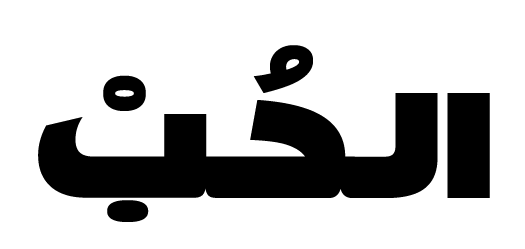
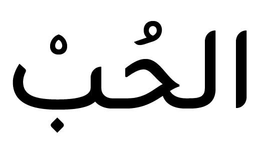
There are two broad categories of Arabic typefaces: modern and traditional. The former comprises two sub-categories: geometric and humanist.
- Modern v Traditional
Many designers still don’t agree on the definition for each, but at Boutros, we’ve defined the lines between the two. While we always look at traditional calligraphic scripts and their proportional systems for inspiration, our modern fonts utilise an entirely new set of proportions.


- Geometric v Humanist
Geometric typefaces are sometimes referred to as Kufi-based, while humanist typefaces are described as Naskh-inspired because they retain traces of handwriting. The latter is better for readability and hence is more used for longer text, while the former, because of its rigidity, is more suitable for short text or headlines.


2. MEDIUM
The second criteria that will further guide your decision, and this is a factor that unfortunately many designers take for granted, is the medium. In other words, the answer to the question ’where are you going to use the font’? On a small sheet of paper or a store sign? On a mobile app or in a magazine?
We optimise each of our fonts for a particular medium, so we can guarantee you will find a typeface that’s right for you.
It’s important to bear in mind that typographic treatment varies significantly from print to web, display to text, and headline to body text. So even for print, there are fonts that are better suited for small and long body text, while others are more suited to bigger headlines.
- Print v Screen (web or TV):
Almost all communication today is being done digitally. So, even when working on a print font, we always keep in mind that eventually, it will need to read well on screen. But if the font will only be used on screen or a specific device, then the design can be optimised for that purpose.


- Display v Text:
A poster, an ad or a store sign are examples where display fonts are ideal. They are striking and attention-grabbing. Magazines, digital and online newspapers, and books need high-quality text fonts that prioritise readability over aesthetics. The goal here is not to attract attention but to engage the reader in longer runs of text.
- Headline v Body Text:
Text fonts can be divided into two categories: headline and body text. The former are usually tighter and more elongated while the latter has more compact spacing. These minor typographic treatments have a significant impact on the readers’ experience.
So, the answer to the question ’which typeface is the right one?’ ultimately lies with you.
There’s no one universally good typeface. Each project, each brand, each medium has its specifications. Once you’ve defined the style and medium you’re seeking, we are happy to offer our recommendations to help you make the best choice.