
Home > Keywords > Font Categories > Arabic Display Fonts
Arabic Display Fonts
Articles
-
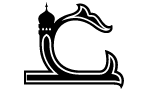 Boutros Minaret
25 April 2012, by George KandalaftOne license only: £75.00 Designers: Boutros Fonts / Mourad Boutros, Arlette Boutros Boutros Minaret was designed for specific religious festivals such as Fitr, Al Adha and all other Islamic feasts and occasions. The font is the result of extensive research by BoutrosTM experts with the aim of serving the needs of the Arabic speaking market for Arabic typefaces for all communication materials. This range was created and designed by Mourad and Arlette Boutros. The design is based on the (…) -
 Boutros Shire Type Arabic
13 October 2012, by George Kandalaft -
 Boutros Advertisers Naskh
19 April 2010, by George KandalaftFamily Pack (one license only): £240.00 Designers: Boutros Fonts / Mourad Boutros, Arlette Boutros The most widely used font for bilingual (Arabic and Latin) signage and way-finding around the world since 1977, for indoor and outdoor signs, airports, hospitals and offices. It was designed in 1977 by Mourad and Arlette Boutros in collaboration with Letraset to work in perfect harmony with Helvetica. The design is based on the classical Naskh script. The addition of linked straight lines (…) -
 BoutrosRounded
3 July 2021, by George KandalaftFor sale for multi-users, corporation and OEM. Designers: Boutros Fonts/Arlette Boutros BoutrosRounded is a squared modern typeface, with soft rounded corners designed for maximum legibility. It is also suitable for virtually all materials in the communications world of today from headlines to body copy. -
 Boutros Daniel
13 January 2018, by Soulaf KhalifehFor sale for multi-users, corporation and OEM. Designers: Boutros Fonts/Arlette Boutros Boutros Daniel is a rounded display typeface. Its geometric structure contrasts nicely with classical Naskh proportions. The rounded terminals add a playful touch and a friendly look. The typeface includes six weights: Ultra Light, Light, Regular, Semi-bold, Bold and Extra Bold. -
 Boutros Noor
13 October 2017, by George KandalaftFamily Pack: £200.00 Designers: Boutros Fonts/Arlette Boutros Boutros Noor is a modern typeface characterised by its geometrical structure and contrasting sharp and rounded features. Designed by Arlette Boutros, Boutros Noor is suitable for headlines and sub-headings, but it can also be used in body text in a wide range of media, for print and screen. Although the design is based on the geometric Kufic, it borrows calligraphic elements from Naskh, to optimise its readability, (…) -
 Boutros Sign 2
26 May 2018, by George KandalaftPrices subject to order details Designers: BoutrosFonts \ Arlette Boutros Boutros Sign is a modern typeface characterised by its geometrical look and high legibility. It is designed for headlines, sub-headings and body text in a wide range of media and it is readable at a small point size. Although applied to a modular structure, the influence of the Naskh style of writing means that the letters are very easy to read. Boutros Sign is a development of the signage font which was designed (…) -
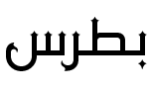 Boutros Falcon
14 February 2018, by Soulaf KhalifehFor sale for multi-users, corporation and OEM. Designers: Boutros Fonts/Arlette Boutros Boutros Falcon is a contemporary Kufic typeface that combines geometry and finesse.-The decorative serifs, terminals and dots give it a distinctively refined elegance and grandeur - the traits of a stellar display typeface. The typeface family includes four weights: Light, Regular, Semi-Bold and Bold. -
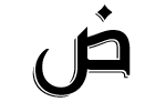 Boutros Hayat
7 January 2017, by George KandalaftOne license only: £90.00 Designers: Boutros Fonts/ Arlette Boutros Boutros Hayat is an exciting new modern display typeface designed for headlines and similar applications in a wide range of media. Characterised by its clean flowing lines and friendly, relaxed design, Boutros Hayat was created and designed by Arlette Boutros. The essentially geometrical structure and distinctive features confer a modern look whilst at the same time respecting Arabic calligraphic and cultural rules. (…) -
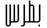 Boutros High
18 March 2018, by George KandalaftFor sale for multi-users, corporation and OEM. Designer: Arlette Boutros Boutros High has elegant looks. It is a tall, condensed and fine modern geometric typeface with rounded edges. It is much narrower than other fonts, which means more characters can fit on a line of type and save space. It certainly makes your text stand out. Boutros High is characterised by tall ascenders and short descenders. Boutros High is suitable for display, not text. It can be used to set larger headlines (…)


